Patagonia Redesign

Patagonia Redesign

Not bound
by convention

Not bound
by convention

When redesigning and re-platforming Patagonia’s e-commerce site, my team and I had the privilege of leaning on 50 years of authentic, values driven design philosophy's. With that also came immense pressure to deliver a product that was useful, versatile, long-lasting, 

Patagonia’s e-commerce design leans on 50 years of authentic, values driven design building products that are useful, versatile, and long-lasting, 

Design to reflect the values of a business started by a band of climbers and surfers, and the minimalist style they promoted.

Demonstrate a bias
for simplicity
Demonstrate a bias for simplicity
Cause no
unnecessary harm
Build the
best product

We built our design system to balance product and purpose, using focus, clarity, and simplicity to deliver the utility people expect from all Patagonia products. Rich photography and sustainability are woven boldly throughout the experience to reflect the brand's commitment to nature and preserving our home planet.

Patagonia’s e-commerce design leans on 50 years of authentic, values driven design building products that are useful, versatile, and long-lasting, 

Inspired by Patagonia’s editorial history and its use of lifestyle photography, we incorporated authentic visuals that reflect the brand’s outdoor spirit, creating an experience that feels true to its roots.

Patagonia’s e-commerce design leans on 50 years of authentic, values driven design building products that are useful, versatile, and long-lasting, 

Solution

A reimagined eCommerce platform that serves as a brand hub for both activism and content, built around a cohesive component library, intuitive UX principles, and a mission-driven narrative.

A reimagined eCommerce platform that serves as a brand hub for both activism and content, built around a cohesive component library, intuitive UX principles, and a mission-driven narrative.

Outcome

+25% Mobile conversions

+25% Mobile conversions

Webby - Multi-category Winner

Webby - Multi-category Winner

Function & fashion

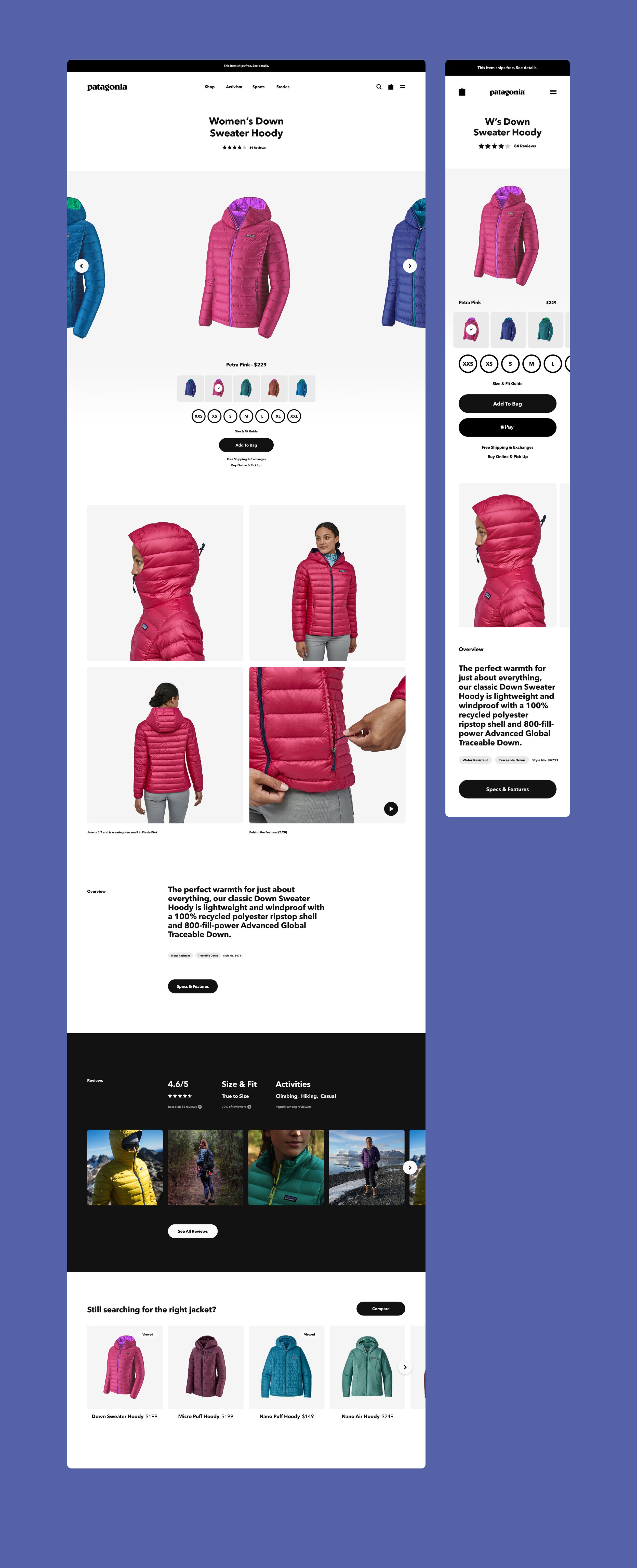
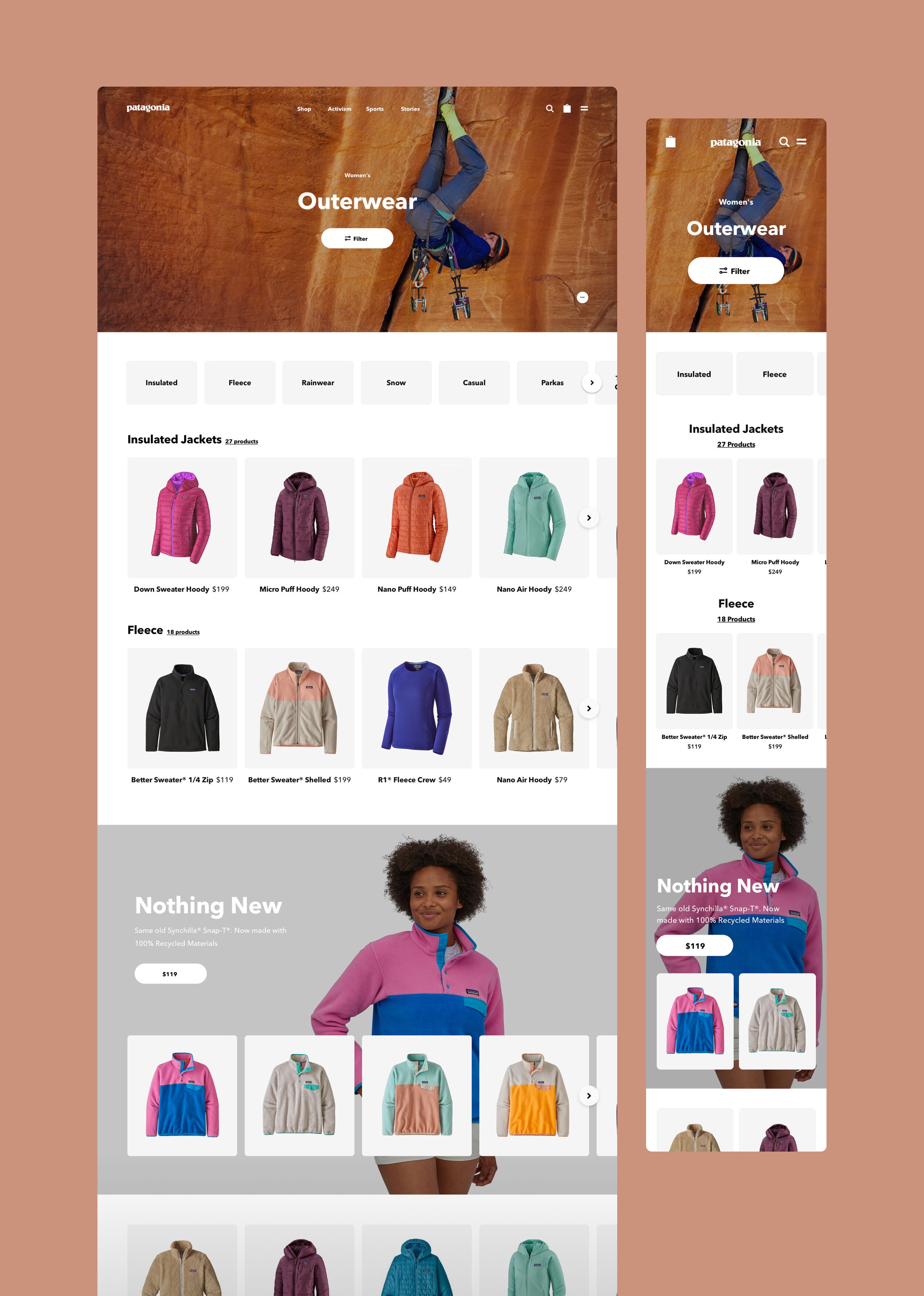
We focused on creating an equally compelling experience on all screen sizes, ensuring that the entire system can seamlessly flex between mobile and desktop.

We focused on creating an equally compelling experience on all screen sizes, ensuring that the entire system can seamlessly flex between mobile and desktop.

Show, don't tell

Patagonia’s products are meant to be experienced, making it essential to showcase their quality, materials, and functionality in a compelling way online. To modernize Patagonia’s e-commerce experience, we developed art direction guidelines and collaborated closely with the in-house photo studio to establish streamlined processes, ensuring each product was accurately and fully represented.

"Uncurious people do not lead examined lives; they cannot see causes that lie deeper than the surface"

-Yvon Chouinard

Causing no unessacary harm

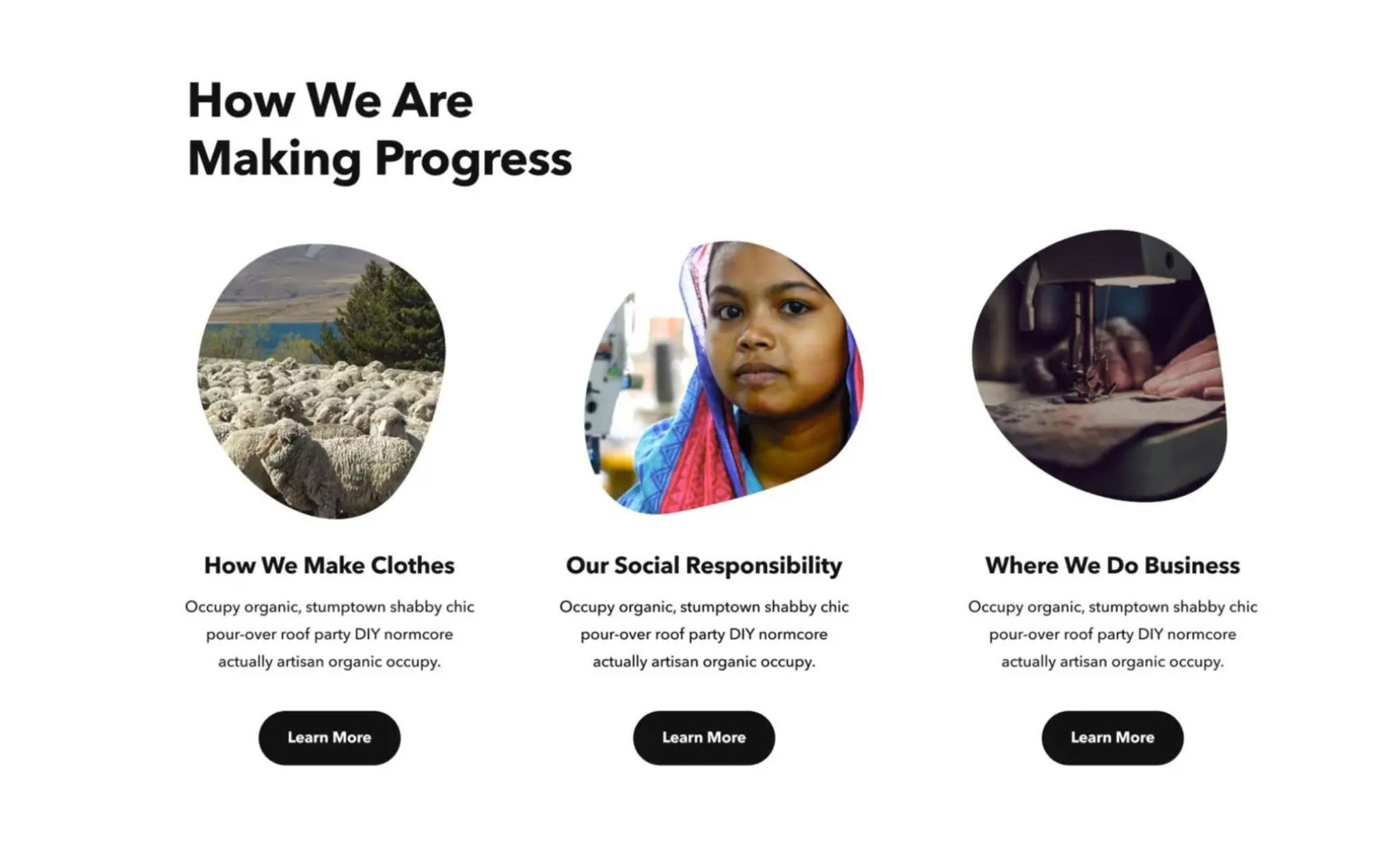
The goal was to create a scalable design system that organized Patagonia’s vast product and content library in a simple yet impactful way. The experience connects with users on both emotional and practical levels, always rooted in the brand’s mission. More than just selling clothing, the system communicates Patagonia’s values and encourages a more mindful approach to consumption.

"Do it our way."

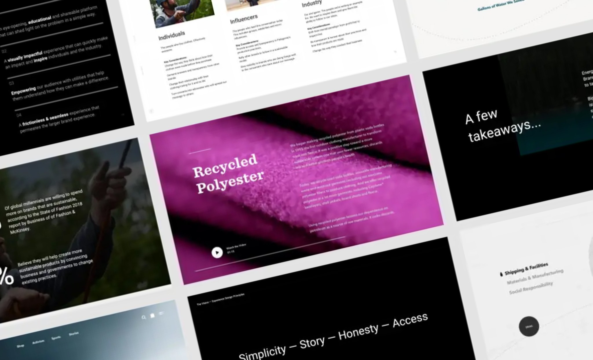
Patagonia's success—and much of the fun—comes from developing new ways of doing things. The most rewarding aspect of this work was the opportunity to prioritize sustainability over conversion. Interrupting the optimal shopping flow to educate and inform users about the environmental and social impact of their behavior was a hard requirement.

Protecting our home planet.

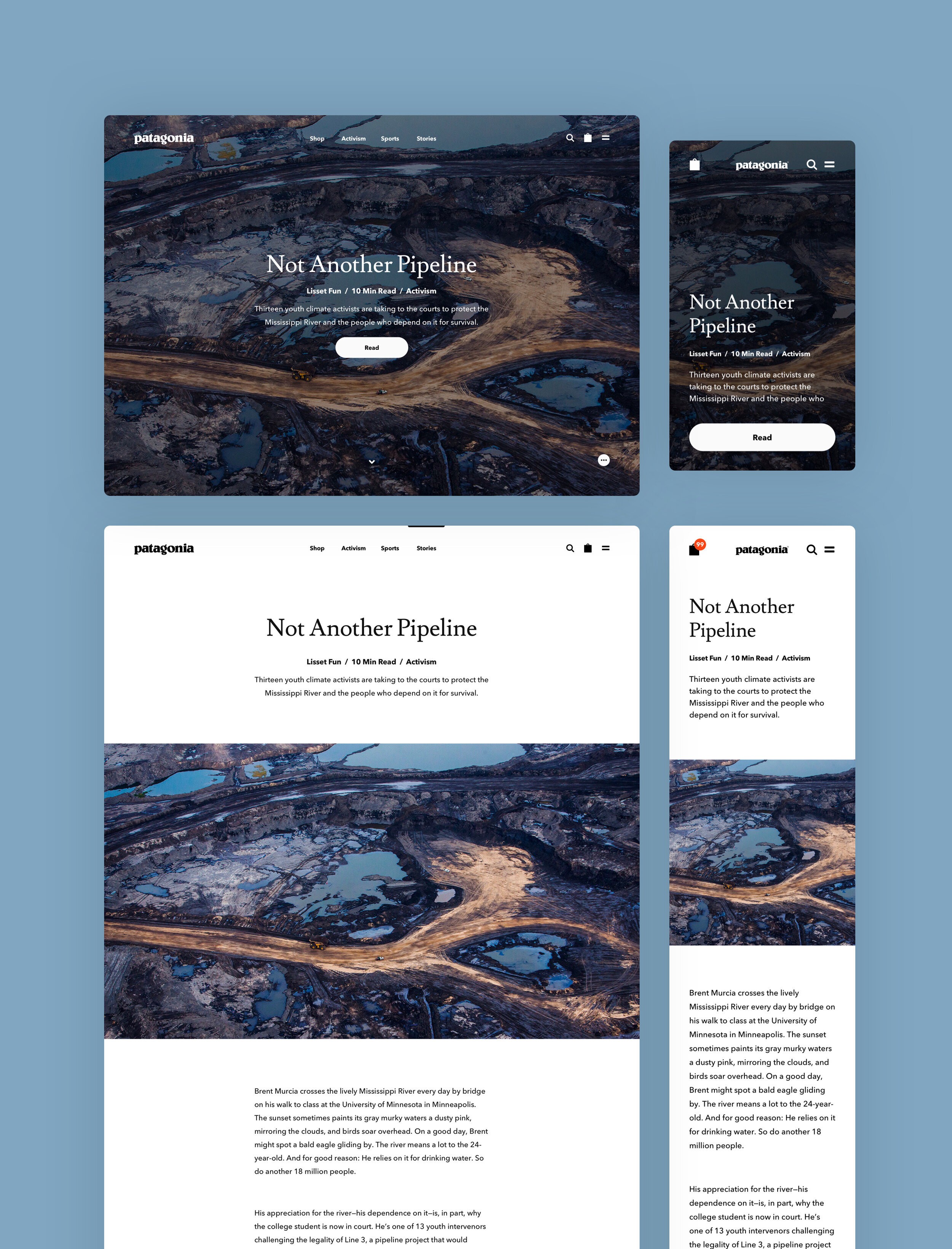
The redesigned 'Cleanest Line'—Patagonia’s 25-year-old blog—aims to empower those taking bold action to protect, restore, and defend the planet. By providing them with a platform to reach Patagonia’s vast audience, the blog amplifies their message and supports their causes.